What do you think of this “one-line pitch” for qweries?

qweries helps everybody

find answers
get in the conversation,
and contribute to your community

by prioritizing diversity and design

As I described on the NWEN blog in The agile one-pager (part 5), a good one-line pitch covers what a company does, who they do it for, and a bit about how. Here’s what I’ve currently got for qweries, a Q&A (questions-and-answers) startup that will compete with sites like Quora and Yahoo! Answers.

Reactions?

Suggestions?

Suppose I were to add a third word: “by prioritizing design, _______, and diversity.”   Some of the possibilities that leap to mind include “privacy”, “community”, “emotion”, “accessibility”, “fun” … Thoughts on any of those, or other ideas?

jon

PS: updated several times, most recently May 25.  Thanks to everybody who’s given feedback, and especially to Mikhaila for

PPS: For more about qwe ries, here’s the current short overview (most recently updated November 2011).  If you can’t get to it via Slideshare links, here’s a PDF version.


Comments

19 responses to “What do you think of this “one-line pitch” for qweries?”

  1. Thoughts:

    * I have know idea who the “you” is… me as a web user? as a developer? as a small business owner?

    * Transformation isn’t inherently good. No one needs transformation. They need more sales. They need better service. etc.

    * Neither “design” nor “diversity” feels particularly heavy to me. They could both mean a lot of things. I’m not sure in one sentence you can really say much about your methods though, so maybe that’s a necessary evil.

    You’re saying “We help you do X by doing Q and P”, where X is pretty vague. Maybe better would be to say “We help A’s do Y” where Y is more specific. After all, Y is what you’re selling. Y is the need that people have. Q and P are just details about how you will get it done for them, but no one cares HOW… they just want to know WHAT.

  2. Thanks Erik for the excellent feedback. I tried it out on a few people last night at the NWEN First Look Forum and similar points came up. I took another pass at it making X more specific …

    I’m still stymied on how to scope the people down. Who uses Google and other search engines? Everybody online (to a first approximation). Who has useful answers to questions? Everybody online (to a first approximation). So still not sure how to make progress on that.

    jon

  3. I’m not sure “search results” is the right phrasing either. Search is a tool not a goal. The goal is “find an answer” — whether “searching” for prices or how-to or background.

    And you probably have two one-liners: one for the folks with content (answers) and one for the folks with questions (searchers).

  4. Excellent points Kathy. People thought my previous ‘web experience’ was too generic and liked the specificity of ‘search results’, but now that you bring it up I agree that it’s got the wrong focus.

    And good point about the two different once-liners. Hmm. Not sure how to get that to happen in the context of an executive summary … worth thinking about …

  5. Before I had seen Kathy’s comment, I spent a while chatting with Josh, who had some good feedback.

    2011-02-18_1610

    He went on to say “I feel like ‘prioritizing design’ is a little amorphous and very relative. Does google prioritize design by letting the data speak? Does apple prioritize design by working hard on user experience? i think everyone says they prioritize design, but what it means is a moving target.” Fair enough. I replied that I thought Google prioritized algorithms and data (Wave is not the kind of product that comes from a company that prioritizes design). Apple prioritizes design and it work well for them, but then again everybody wants to compare themselves to Apple. Why should people reading this believe me?

    After some thought I decided to try a slightly different tack. When I ran it by Josh, he was enthusiastic — and gave me some helpful feedback on fonts. Here’s what I came up with (not yet incorporating Kathy “two one-line pitches” suggestion):

    qw3ries helps you find answers by prioritizing design and diversity

    Pretty! And hopefully it starts to give an inkling about why design is so critical and how we really will be pursuing innovative solutions. The layout conveys a lot of information very efficiently and clearly could allow for very efficient navigation. And in my longer discussions last night, one of the aspects of ‘diversity’ that resonated with everybody is “many right answers”; so this help gets people about one of the things I mean, and invites more conversation on the topic. Plus there isn’t anything out their on any of the mainstream sites that looks like this, so it highlights our branding opportunities. And it’s pretty and colorful too!

    As you have probably guessed, I have no graphic arts training. So it doesn’t look anywhere near as good as it should. At some point I’ll ask one of my friends with visual skill for some help. But I’m pretty happy with it for now 🙂

  6. I think this looks great, jon!

    The focus on diversity and design seems quite apt, though it seems like the conversation about how to best leverage the design elements has been particularly fruitful.

    Of the other potential words to include, I was most drawn to community, as that would be another big differentiator with Quora. This is in regards to the diversity component, as Quora is a specific community…of white straight Silicon Valley techie guys.

    With Qw3ries’ diversity, the community will be much more inviting, engaging, and representative of the potential market at large. By its nature it will be more valuable to more people, and considering how neglected these diverse constituencies are for the white straight Silicon Valley techie guys, it will be quite valuable to them as well if they choose to pursue its benefits.

    Anyways, regardless of whether community makes it into a one line pitch (I’m not sure if that’s necessary at all), I see this as a primary benefit for Qw3ries, and can see the company proudly promoting this attribute in kind!

  7. Thanks Harry for the feedback. I wound up using community as an axis highlighting our competitive advantages. And totally agreed on how the diverse community will be more interesting.

  8. two question marksOne of the people I asked for feedback on Facebook had some great comments. Here they are (with permission of course):
    I think you may be underselling the combo of good content and good search. Both content (contributions) and search (algorithms) are may be constrained by lack of diversity, so taking an intentionally inclusive approach to both, simultaneously, might be bigger contribution than you make it out to be.

    My sense is that ‘better answers’ come from better invitations to contribute– including better interfaces, built-in and automatic routines of reinforcement, sense of community, etc. If qw3ries had some good ways to ‘entice’ contributions from people and groups that traditionally are overlooked but who harbor/hold important expertise. Quality of answers is critical enough that this one set of innovations could lead the idea.

    I think you have several kinds of innovation, some more key to the product and some that are just more ethical/respectful. The first ‘sell’ the idea, the second are more ‘nice to have’ but aren’t necessarily linked to a product benefit. (Some of the concepts mentioned are less important than others, from a marketing/one-pager perspective.) One way to address these differences without making a point of them is to point each innovation to an area of product feature — into separate sentences the innovations that relate to 1. content and search, 2. environment – community (e.g, privacy, trolls), and 3. monetization (relevant and privacy-respecting advertising).

    small though– I’m not worried about ‘spammers’ per se. i don’t like crappy ‘fake’ search results. Language that works better for me is ‘more accurate, more informative, more helpful answers at the very top of your results’

    For me, visuals and triggers for contributing, and methods for reaching out to difft groups, are more important than language issues. I’d much rather have diversity, depth and richness within the English language than less depth and richness in more languages. Not to sound heretical, but … I think that language is a natural boundary that makes sense. I think that it’s more quickly viable to get diversity w/in a language group, and put language diversity as a big challenge for 2, 3, 4 steps later. Just thinking of the challenges of search in Russian vs. English— makes me shudder to think of taking this on as a feature of a new platform.

    Alternatively, language diversity could be “the” defining feature of the platform, but then you’d have to put other dimensions aside.

    these are all thought from the naive reader

    “Naive?” Yeah, right. Great feedback. Response soon … but first I’ll make some meta-points.

  9. The story so far: between Thursday and Monday, I got valuable feedback on the one-line pitch and executive summary from almost a dozen people: five in-person, two in IM or chat, two on the blog, one in email, two via Facebook, and one via Twitter.

    Thinking about this as a use case for a Q&A system that prioritizes diversity … one of the dimensions of diversity is “preferred communication methods”. Ideally, people should be able to ask, find out about, and answer questions via any of these channels. Some Q&A systems do some of these integrations well: Aardvark and GChat, or so I’m told; LinkedIn and email integration. Most give you the ability to share questions on Twitter and Facebook. But nobody so far has really tied in social media in general.

    So along with ‘community’, another dimension on the ‘competitive advantage’ chart is “social media” integration. And when somebody asks me “could you give an example of what you mean by that?” I’ll point them to this comment 🙂

  10. Returning now to the previous comment: wow, I certainly don’t mean to undersell the combo of content and search and the advantages of diversity in both dimensions! Totally agree with the value of enticing contributions from people/groups/organizations who are typically overlooked … I was trying to say that, and will look at how to do a better job of it. Enticing is a great word by the way, expect to see it in a future version of the one-pager.

    > One way to address these differences without making a point of them is to point each innovation to an area of product feature — into separate sentences the innovations that relate to 1. content and search, 2. environment – community (e.g, privacy, trolls), and 3. monetization (relevant and privacy-respecting advertising).

    Excellent suggestion

    > I’m not worried about ’spammers’ per se. i don’t like crappy ‘fake’ search results. Language that works better for me is ‘more accurate, more informative, more helpful answers at the very top of your results’

    Good point, I’ll rephrase as a positive

    > For me, visuals and triggers for contributing, and methods for reaching out to difft groups, are more important than language issues.

    It’s all important! As a native English speaker, yes of course I want depth and richness in my language … I suspect others do in their native languages. And as somebody who actively follows news and discussions from Iran, I would _love_ to have more access to all the knowledge that’s not available in English.

    > Alternatively, language diversity could be “the” defining feature of the platform, but then you’d have to put other dimensions aside.

    I certainly see language diversity as *a* defining feature but don’t think it means we have to give up on others. If you architect from the beginning for multiple language support and automated/expert/crowdsourced translations, you’ll have a much more flexible platform — and appeal to multi-linguals, who are a decent-size segment that it doesn’t seem like anybody’s targeted. Conversely if you don’t do it up front it’ll be very hard to add in after the fact. So, point taken about wanting to minimize complexity, but I see this as a pretty core feature — and complementary to everything else.

    > these are all thoughts from the naive reader

    The author of the comments clearly isn’t naive, but is from outside the ‘web startup mainstream’ — which is part of why the feedback is so valuable!

    jon

  11. And some good suggestions from my Mom for a third word to add in:

    qw3ries helps everybody find answers and share information by prioritizing diversity, inspiration, and design

    qw3ries helps everybody find answers and share information by prioritizing diversity, imagination, and design

  12. cover for CTWYSEAfter I left Microsoft, I’ve stayed in touch with a bunch of my former colleagues in the Asset-Based Thinking group. Today’s phone call was a great chance to get feedback on the qw3ries one-line pitch. After I read it aloud, here’s how the discussion went (quoted with permission).

    Mary Alice: unusual combination — don’t often hear “diversity and design” I spend so much time hearing about prioritizing projects etc.

    Eve: a lot going on for me. trying to figure out all the ideas actually are fitting together. You’ve got people finding information, then prioritizing,

    Michele: I was a great fan of ask.com … is your model similar?

    Jon: yes! lots of analogies

    Eve: eyes lit up with advertising. agencies targeting Spanish-speakers in the US. “trying to reach markets with a service that traditional markets aren’t working”. a strategy that seems to work is to pick a couple of big ones as primary examples. show how when we focus on reach beyond the traditional, expertise grows. recently spoke w/ ad agency: after started out with Asian Americans and Mexican-Americans, our processes got good at targeting any traditionally underserved audience.

    Diversity’s a tricky word — means a lot of different things to different people, a lot of people it doesn’t mean anything too.

    Mary Alice: broad, so combined with advertising, terms like underserved market, microniches

    Eve: talk with ad firms that do that.

    Mary Alice: my youngest just got her second magazine subscription, American Girl. the mag market might be dying, but for new young readers, the mags might be doing well. what you’re trying to do is capature the underserved market with targeted processes and messages.

    Michelle: instead of talking about serving a specific group and using that tricky word diversity, i might talk instead about making global connections. what research does in the long run is connect us — searching for information is about the connections people are trying to make.

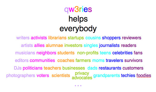
  13. qw3ries helps everybody

    Even though this picture is a work in progress, it’s far enough along enough to illustrate a couple of key points:

    – view each entry in the grid as a market segment. how many Q&A sites are actively targeting that segment? There are a few examples (Sprouter just pivoted to be “Q&A for entrerpeneurs”) but mostly there’s a heck of a lot of open market space out there.

    – now view each pair of entries as a possible topic area: “questions related to the interactions between X and Y”. Each of these is an opportunity to become a destination site that appeals both to X and to Y. For example, if qw3ries has a bunch of good questions and answers related to privacy and startups, it’ll become a go-to site for startups who care about privacy, and for privacy advocates who want to influence startups or get asked for advice.

    – many combinations of three or more could be interesting: moms who are at non-profits and startups, journalists writing about privacy and startups, celebrity student-athletes, etc. etc.

    Of course we can’t do all 42 of these (let alone all 1600+ two-way combinations and 67000+ three-ways) simultaneously right out of the box. This is where the “go to market strategy” comes into play: which to start with and how to get word out to people who are interested? How to expand on initial successes? A revised version of this grid will be a good way for thinking about this — and describing it visually.

    jon

    PS: If you’re wondering, the colors are intended to be very rough categories: “creatives”, society, education, business, family, people who already receive too much attention but are important from the perspective of any startup, and … ummm …things that don’t fit into the other columns. Did I mention it’s a work in progress?

    PPS: thanks to @yuricon for the Twitter conversation that sparked the visual presentation, and to Chryssa and Amy for feedback on earlier versions.

  14. Josh’s feedback:

    i really like the separation into different groups, especially the under-represented groupsi think that the secret sauce would be how you're reaching those peoplethose over-represented groups seem over-represented because they're easy to reach, ya know?yeah,

  15. Wow, that was a great read, Jon. I wish I had read it earlier!

    I thought it was pretty good but everyone made some really great and valid points. I think everyone touched on some great points and the only feedback I have for you is that I found some typos. =)

    Look forward to any changes and reading them!

  16. Thanks Denzil! I’ll follow up via email on the typos …

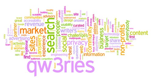
  17. Here’s the Wordle of the current version of the executive summary:

    word cloud: qw3ries, search, market, non-profits, sites, ...

  18. […] The Q&A (question and answer site) market segment is red hot right now.  Here’s some links to complement my own posts Life imitates art imitates life, Prisms, Kool-aid, and Opportunity, and What do you think of this one-line pitch for qw3ries? […]

  19. Can you avoid the buzz word “prioritizing”?

Leave a Reply

Your email address will not be published. Required fields are marked *